PROJECT YEAR - 2022/23
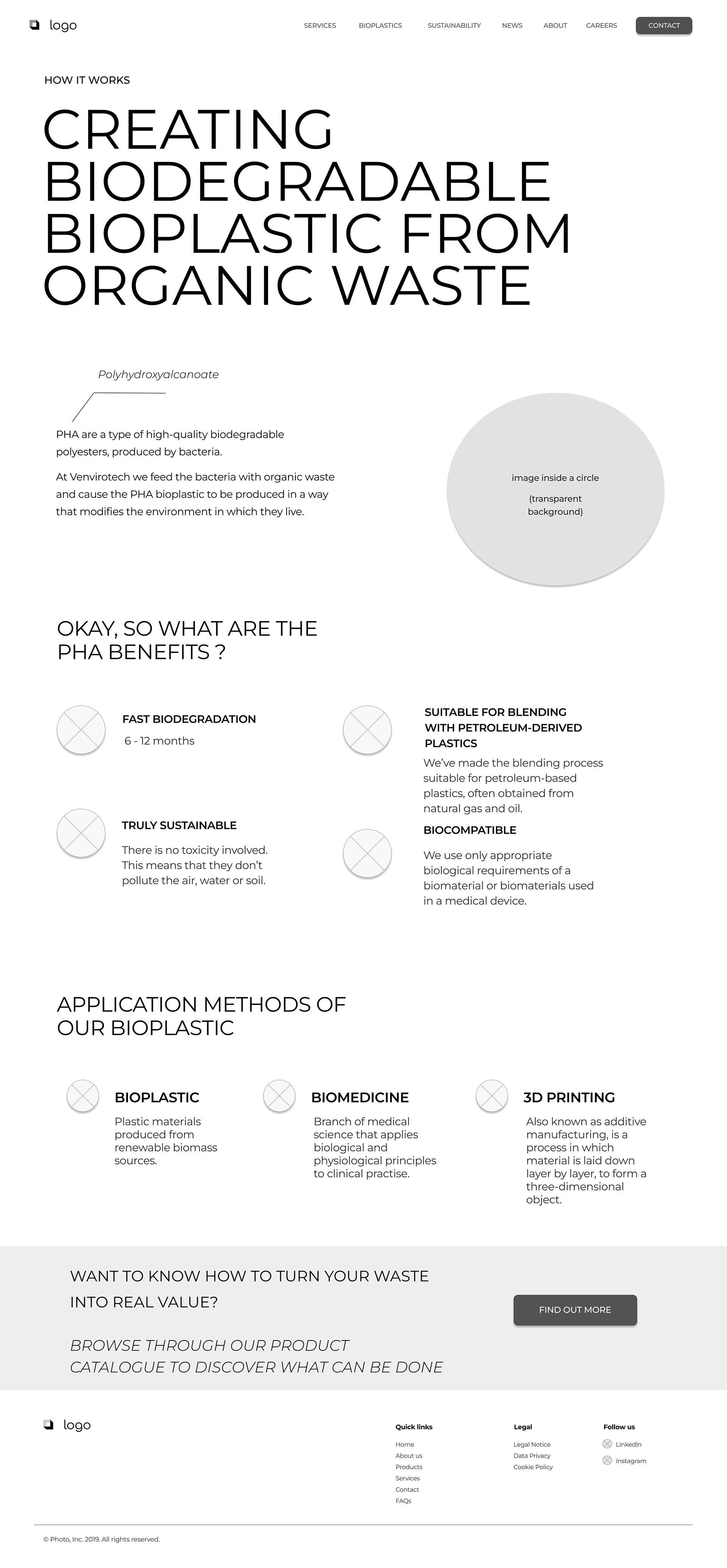
The goal of this project was to completely redesign the whole branding of an old biotech website design. The overview of what they do is dedicated to the transformation of organic waste into Polyhydroxyalkanoate (PHA) bioplastics that are characterised by being produced by bacteria, biodegradable in the environment and compatible with the human body.
But before we got to the design part, we had to make a thorough market analysis to understand which relevant markets and countries can lead our client to achieving higher B2B conversion rates. We presented key findings as a team and made strategies around appropriate execution.
My contribution
Market research
Market analysis
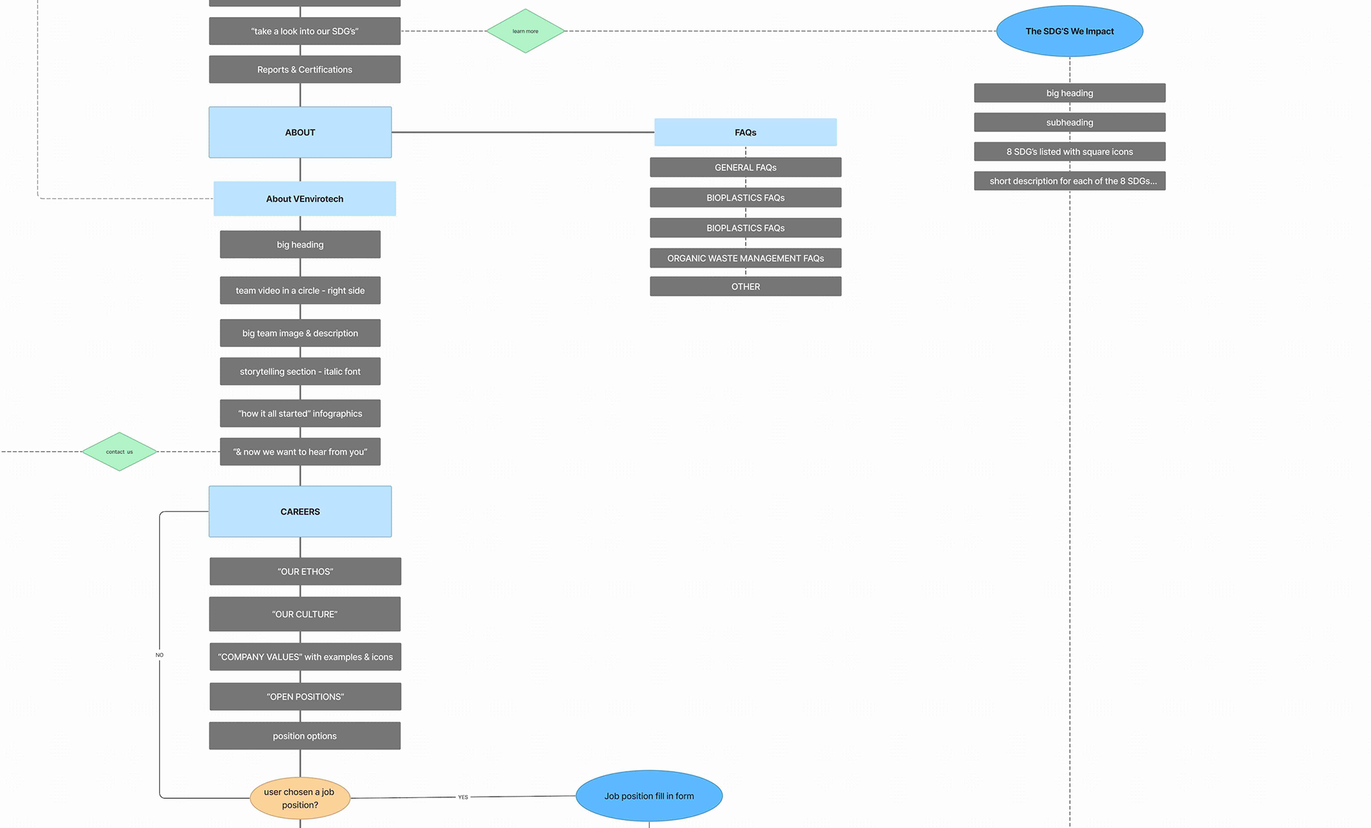
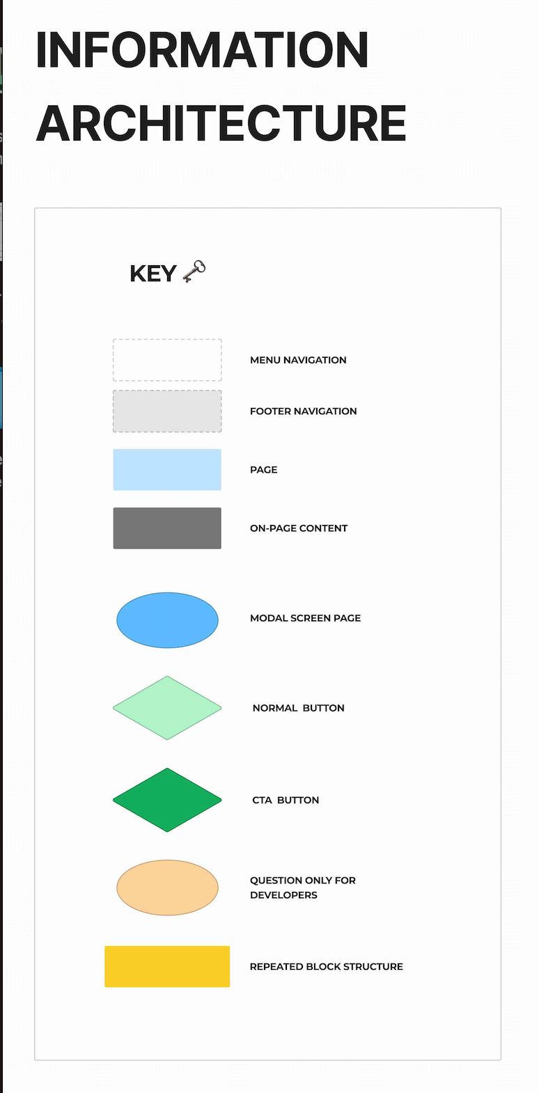
Information Architecture
Low-Mid Fidelity Wireframes
English Copywriting creation & proofreading
Design Proposal & Presentation
The team
1 x project manager
1 x product designer
2 x engineers
1 x product photographer
Process
Conducting an in-depth & organised market analysis
We broke their complex service and product into the very basics, the bioplastic industry. From that, we spent 2 weeks researching every single sector involved within the bioplastic industry locally, as well as across the EU & United Kingdom. Once we were ready to present our findings, our project manager conducted this part of the project mainly due to the language barrier of some of our team members. We worked with international clients, on a day-to-day basis.
As a team, we assigned two market categories to each person and spent up to ten days of intense research into all relevant topics. Using the helping hand of productivity and organisation - Notion.
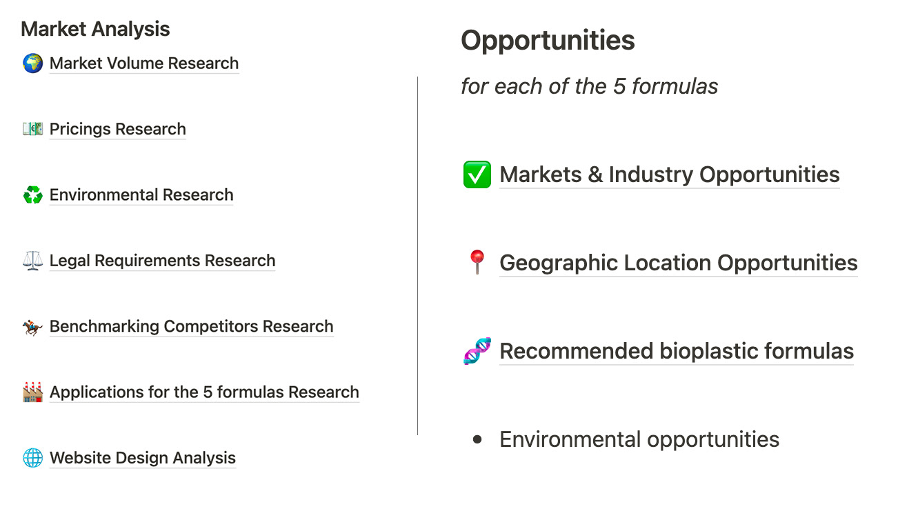

Once I had a full understanding of the required pages and ideal B2B target audience confirmed by our client, information architecture was built.
This also served as a useful starting point for the development team involved in this project.
Challenges along the way
We came up against some friction along the way, such as finding out relevant pricing market information. Nearly all of our competitors weren't responsive when trying to find out prices of similar products on the market. We were working under strict timings, that our project manager has set for us and it was important to stick to that in order to perform weekly meetings in an organised manner with our client.
However, one eventually did get back to us and that helped our client understand what pricing numbers they're up against in the EU market. By that point, I have already designed all of the mid-fidelity screens and even began with english copywriting and/or proofreading whenever necessary.
My english native speaking abilities were very handy in a team of mainly spanish team members, to deliver proofreading in order to achieve that perfect copywriting for the client was a proactive gesture from me. Not necessarily a classic UX/UI designer requirement. Our thorough market research proved that English was one of the key languages needed for such a website, as well as german, french and spanish.


Outcome
After a few iterations of all the screens required, I got to a well-performing mid-fidelity website structure that the client was satisfied with.
Since the company had a service and a product, it was important to redesign the look of the website in a way that targets both of the business's value proposition.